

はじめに
CSS変数(カスタムプロパティ)は便利ですが、transition や animation でアニメーションさせようとしても、うまく動かないケースがあります。
たとえば、次のコードは期待通りに動きません。
See the Pen Untitled by ito web制作 (@ito-web) on CodePen.
なぜかというと、CSS変数はデフォルトでただの文字列として扱われるからです。ブラウザは "100px" と "200px" の間をどう補間すればいいのか判断できず、パカッと瞬間的に切り替わるだけになります。
この問題を解決するのが @property です。CSS変数に型情報を与えることで、ブラウザが値を数値として認識し、なめらかに補間できるようになります。
@property の基本構文
@property --my-variable {
  syntax: "<length>";      /* 値の型を指定 */
  inherits: false;         /* 親要素から継承するか */
  initial-value: 0px;      /* 初期値(型に合った値を必ず指定) */
}3つのプロパティはすべて必須です。
| プロパティ | 役割 |
|---|---|
| syntax | 値の型を定義する。ここが核心 |
| inherits | 親要素の値を子に継承するか。アニメ用途はほぼ false |
| initial-value | 変数の初期値。syntax に合った値を指定する |
inherits についてfalse にすると各要素が独立した値を持ちます。スキルバーやプログレスバーなど、要素ごとに別々にアニメーションさせたい場合はこちらを使います。true にすると通常のCSS変数と同様、親から子へ値が継承されます。
See the Pen Untitled by ito web制作 (@ito-web) on CodePen.
@property が必要なケース・不要なケース
background-color や color など、CSSプロパティ自体がすでに型を知っている場合は不要です。
/* これは @property なしで動く */
.c-btn {
  background-color: var(--btn-bg);
  color: var(--btn-txt);
  transition: background-color 0.3s, color 0.3s;
}グラデーションや hsl() のように、CSS変数が値の一部として埋め込まれている場合はブラウザが型を推測できず、補間されません。
/* これは @property なしでは動かない */
.box {
  background: linear-gradient(135deg, hsl(var(--hue), 60%, 50%), #7F77DD);
  transition: --hue 0.6s ease; /* hue が文字列扱いになるため補間されない */
}syntax の種類と実装例
See the Pen Untitled by ito web制作 (@ito-web) on CodePen.
<length> — 長さの値
px / rem / em / vw などの単位付き長さ。width や height、translate の距離などに使います。
/* 型定義 */
@property --bar-width {
  syntax: "<length>";
  inherits: false;
  initial-value: 0px;
}

/* 使用例:プログレスバー */
.progress-fill {
  height: 8px;
  width: var(--bar-width);
  background-color: #1D9E75;
  border-radius: 99px;
  transition: --bar-width 1.2s cubic-bezier(.4, 0, .2, 1);
}

/* JS やクラス付与でアニメーション発火 */
.progress-fill.is-active {
  --bar-width: 78px; /* または % 換算でも可 */
}<percentage> — パーセンテージ
% 単位の値。親要素への相対値として扱われます。グラデーションのカラーストップ位置にも使えます。
/* 型定義 */
@property --progress {
  syntax: "<percentage>";
  inherits: false;
  initial-value: 0%;
}

/* 使用例:スキルバー */
.skill-fill {
  height: 8px;
  width: var(--progress);
  background-color: #378ADD;
  border-radius: 99px;
  transition: --progress 1s cubic-bezier(.4, 0, .2, 1);
}

.skill-fill.is-active {
  --progress: 85%;
}

/* 使用例:グラデーションのストップ位置アニメーション */
@property --color-stop {
  syntax: "<percentage>";
  inherits: false;
  initial-value: 0%;
}

.grad-bar {
  background: linear-gradient(
    to right,
    #378ADD var(--color-stop),
    #E6F1FB var(--color-stop)
  );
  transition: --color-stop 1s ease;
}

.grad-bar.is-active {
  --color-stop: 70%;
}<number> — 単位なしの数値
単位なしの数値。scale() のスケール値や hsl() の hue 値などに使います。
/* 型定義 */
@property --hue {
syntax: "<number>";
inherits: false;
initial-value: 160;
}
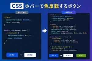
/* 使用例:hover で色相がシフトするグラデーションボタン */
/* グラデーションの transition は @property なしでは不可能 */
.c-btn--gradient {
--hue: 160;
background: linear-gradient(
135deg,
hsl(var(--hue), 65%, 45%),
hsl(calc(var(--hue) + 60), 65%, 55%)
);
transition: --hue 0.6s ease;
color: #fff;
border: none;
padding: 12px 32px;
border-radius: 8px;
cursor: pointer;
}
@media (any-hover: hover) {
.c-btn--gradient:hover {
--hue: 260; /* hover で色相がなめらかにシフト */
}
}<angle> — 角度
deg / rad / turn などの角度値。rotate() や conic-gradient の角度アニメーションに使います。
/* 型定義 */
@property --rotate {
  syntax: "<angle>";
  inherits: false;
  initial-value: 0deg;
}

/* 使用例:rotate アニメーション */
.icon {
  transform: rotate(var(--rotate));
  transition: --rotate 0.4s ease;
}

.icon.is-open {
  --rotate: 180deg;
}

/* 使用例:conic-gradient で純CSS円グラフ */
@property --pie-angle {
  syntax: "<angle>";
  inherits: false;
  initial-value: 0deg;
}

.pie-chart {
  width: 80px;
  height: 80px;
  border-radius: 50%;
  background: conic-gradient(
    #378ADD var(--pie-angle),
    #E6F1FB var(--pie-angle)
  );
  transition: --pie-angle 1.4s cubic-bezier(.4, 0, .2, 1);
}

.pie-chart.is-active {
  --pie-angle: 252deg; /* 70% = 360 × 0.7 */
}<color> — 色の値
#hex / rgb() / hsl() などの色値。グラデーション内のカラーをアニメーションさせるときに真価を発揮します。
/* 型定義 */
@property --color-from {
  syntax: "<color>";
  inherits: false;
  initial-value: #378ADD;
}

@property --color-to {
  syntax: "<color>";
  inherits: false;
  initial-value: #7F77DD;
}

/* 使用例:グラデーションの色自体をアニメーション */
.hero-bg {
  background: linear-gradient(135deg, var(--color-from), var(--color-to));
  transition: --color-from 1s ease, --color-to 1s ease;
}

.hero-bg.is-active {
  --color-from: #D85A30;
  --color-to: #FAC775;
}<length-percentage> — 長さ or % どちらでも
px でも % でも受け付ける柔軟な型。固定値と相対値を混在させたい場面で使います。
/* 型定義 */
@property --offset {
  syntax: "<length-percentage>";
  inherits: false;
  initial-value: 0px;
}

/* 使用例:translate の値を動的に変える */
.floating-btn {
  transform: translateY(var(--offset));
  transition: --offset 0.4s ease;
}

/* px でも % でも代入できる */
.floating-btn.is-hidden {
  --offset: 80px;   /* または 100% でもOK */
}まとめ
@property を使うべき場面は明確です。「CSS変数が値の一部として埋め込まれているとき」、つまりグラデーションや hsl() のように、変数だけを transition で補間できないケースです。
| syntax | 主な用途 |
|---|---|
| <length> | プログレスバー、幅・高さのアニメ |
| <percentage> | スキルバー、グラデーションstop位置 |
| <number> | hsl() の hue 値、scale() のスケール |
| <angle> | rotate()、conic-gradient の円グラフ |
| <color> | グラデーション内の色変化 |
| <length-percentage> | px と % を混在させたい柔軟な指定 |
ブラウザ対応は Chrome / Edge / Safari / Firefox(2023年以降)で問題なく、実務投入できるレベルです。
「グラデーションのhoverアニメがデザインカンプに入っていた」「円グラフをJSなしで動かしたい」——そんな場面でぜひ @property を引き出してみてください。